Client: Deutsche Telekom
Type: App Design / Motion Design
Program(s): Photoshop, Adobe AfterEffects
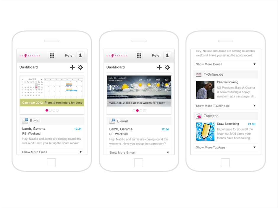
The concept evolution for the design of Telekom's Favoriten, a responsive webpage providing the customer with an overview dashboard of their information, all at a glance. Designs were created for web and mobile and I produced a video prototype that proposes possible concepts to enrich the user experience, and express the "always with you overview" that the Telekom service provides.
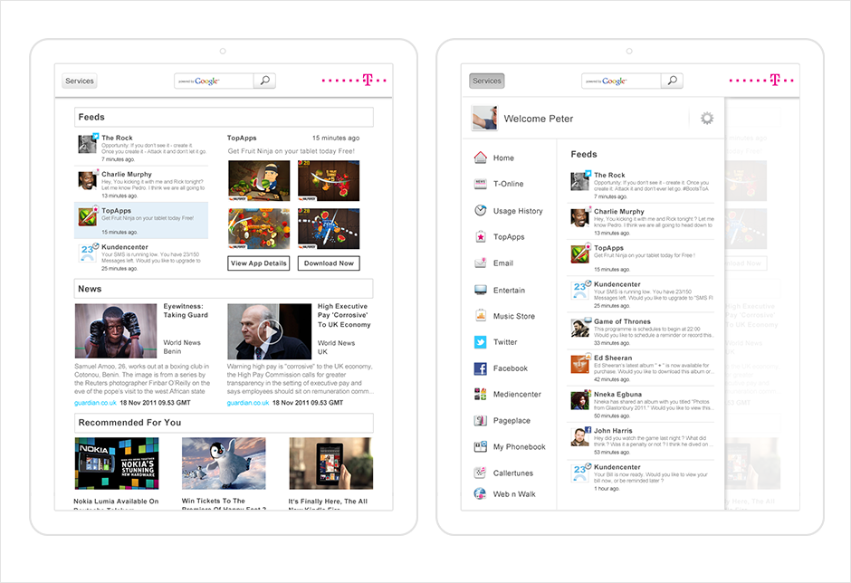
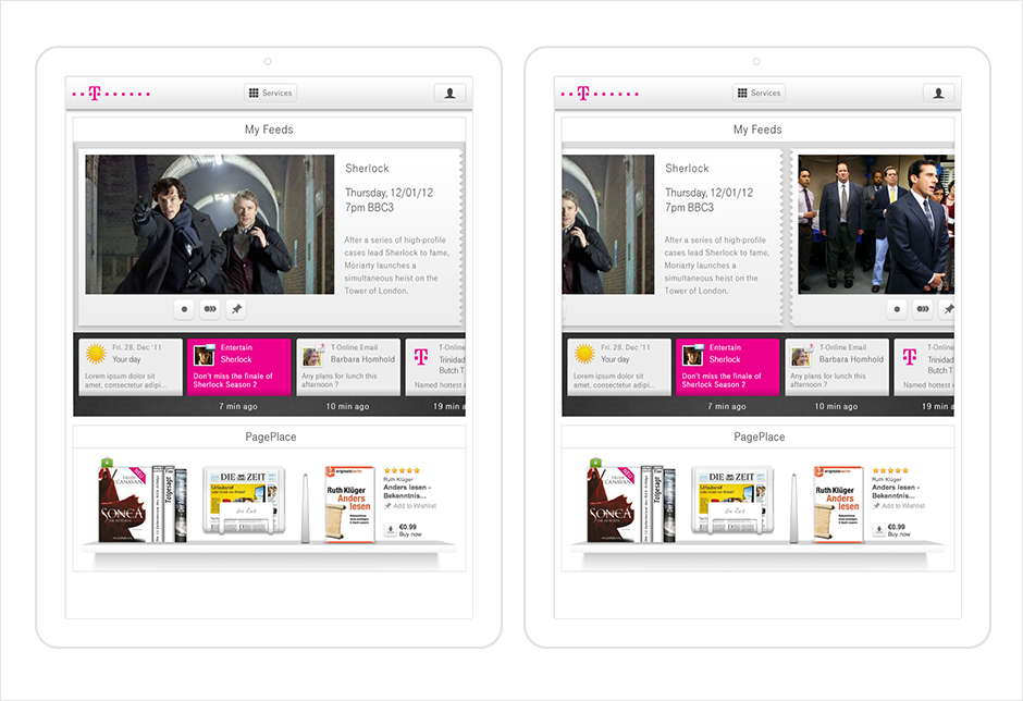
Content is King
Early designs showed the content dictating the structure of the page. A services draw was accessible across all Telekom webpages which acted as a mini overview dashboard letting the user see all of their information without having to leave the page they were currently on.

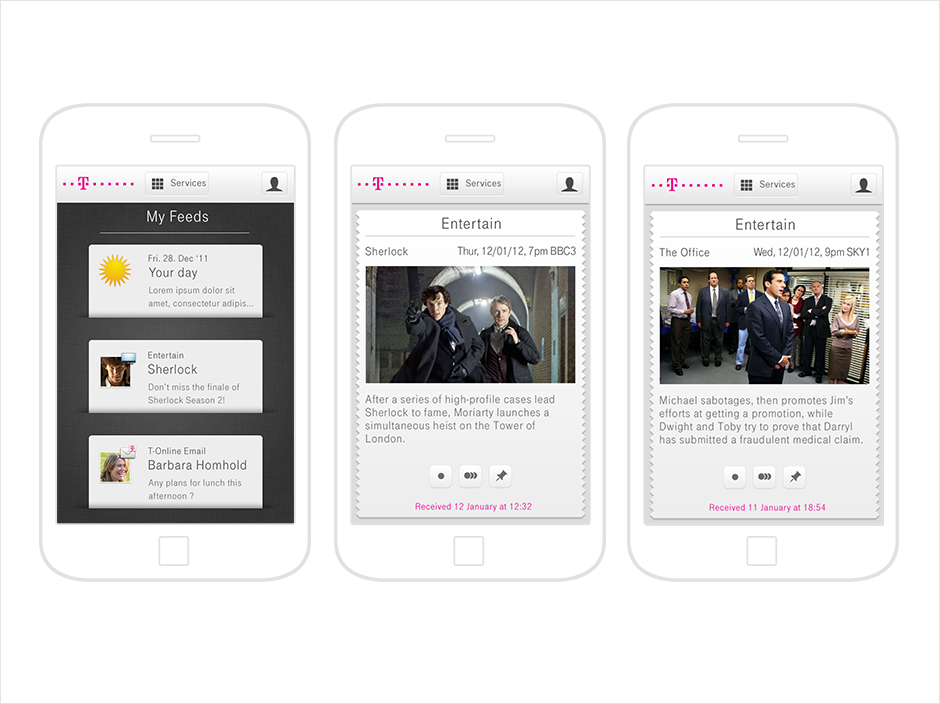
Paper Slips
A more emotive exploration, providing the user's feeds on slips of paper. The highlighted view of the selected paper slip above showed a more detailed view of the feed with relevant actions. The user scrolls / swipes horizontally on both levels to browse through their content.
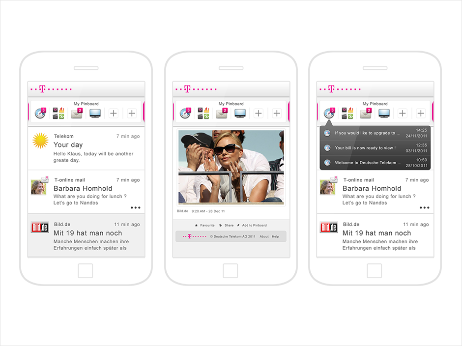
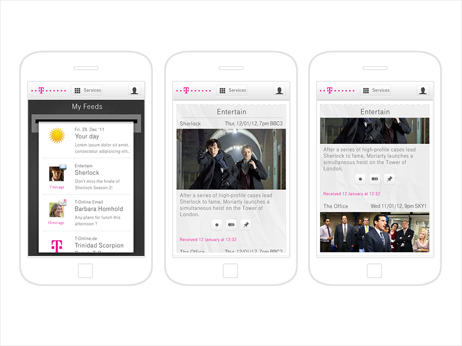
Ticker Tape
A more detailed exploration of the feed aspect of the information. The ticker tape would animate down nicely when a new feed came through moving older feeds down. The user can scroll / swipe vertically through the ticker tape roll to see older feeds. The highlighted view of the selected feed shows a tear off of the highlighted feed allowing for a more detailed view of the feed along with relevant actions. The user scrolls / swipes vertically through the tear off to view older feeds from that selected source.
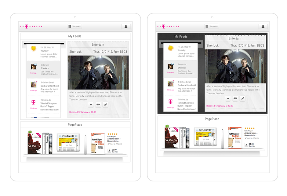
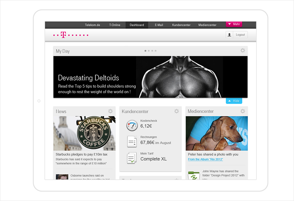
My Day
We introduced a user-centric magazine module, which was to become the focus of the page, giving the user a more immersive experience. This "My Day" module populated content depending on the user's interests, profile and location. The remaining content on the page was then bubbled up in service modules.

Magazine
We updated the "My Day" module to look and feel more like a magazine. We wanted the user experience to replicate flipping through and browsing a tailor made magazine. Changing the design of the "My Day" helped distinguish it from the rest of the modules on the page creating more focus.

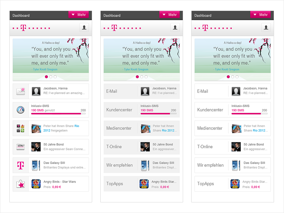
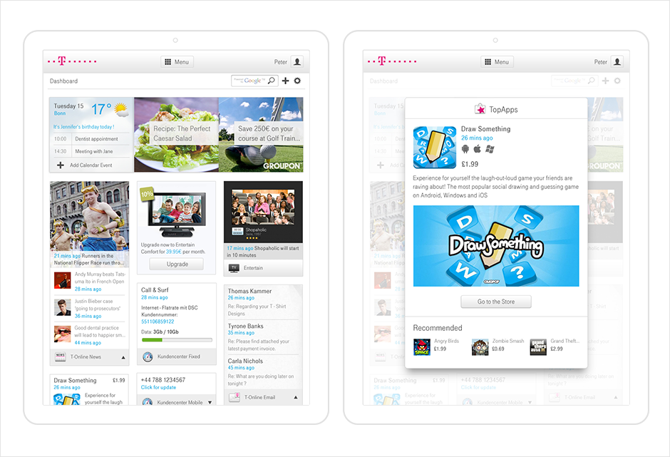
Richer Modules
Here we pushed the design of the modules, focusing on giving a richer feel. Fonts and icons were increased in size, and where possible large content hero images were displayed. Making the user-centric module collapsable provided the opportunity for an animation when a new article or story became available, drawing attention to the real-time nature of the module.

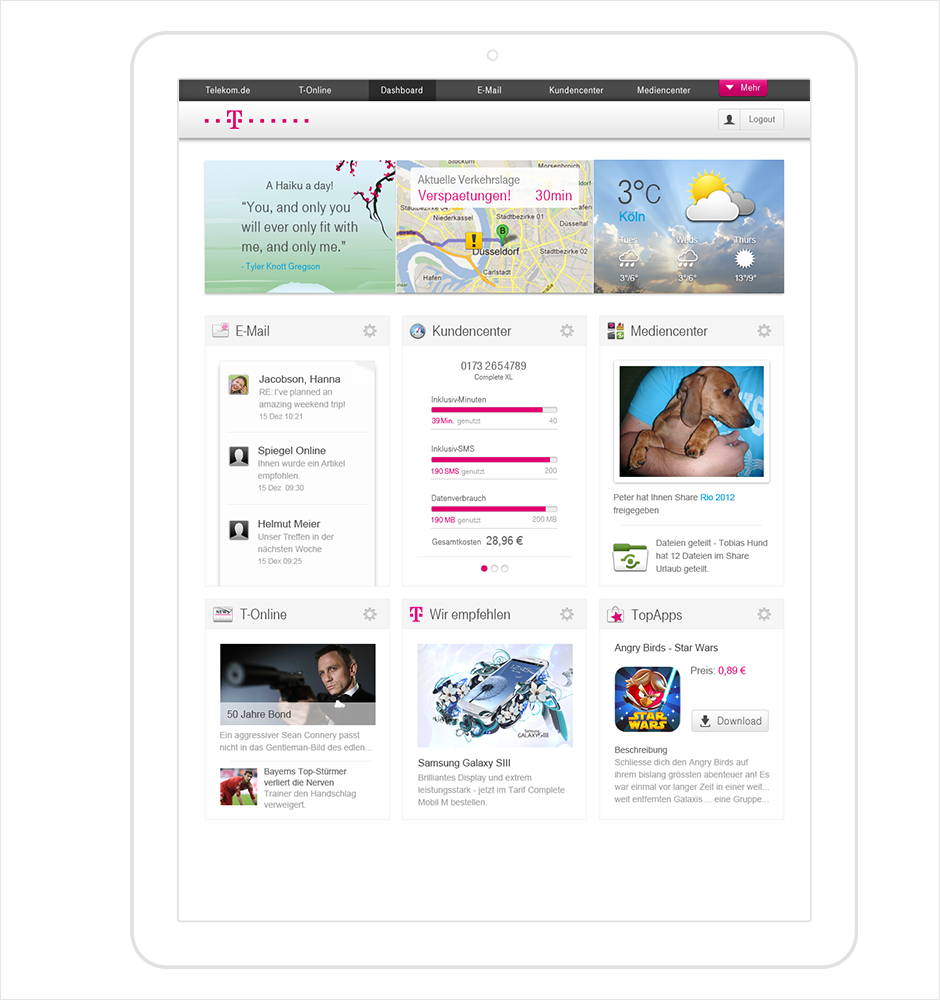
Final Iteration