Client: Heute
Type: Visual Design
Program(s): Sketch
I was tasked with the website redesign of the Austrian national tabloid Heute white at Usecon. Working closely with the UX team, we aimed to create a modern, user-friendly, and responsive website that would deliver an optimal viewing experience across all devices.
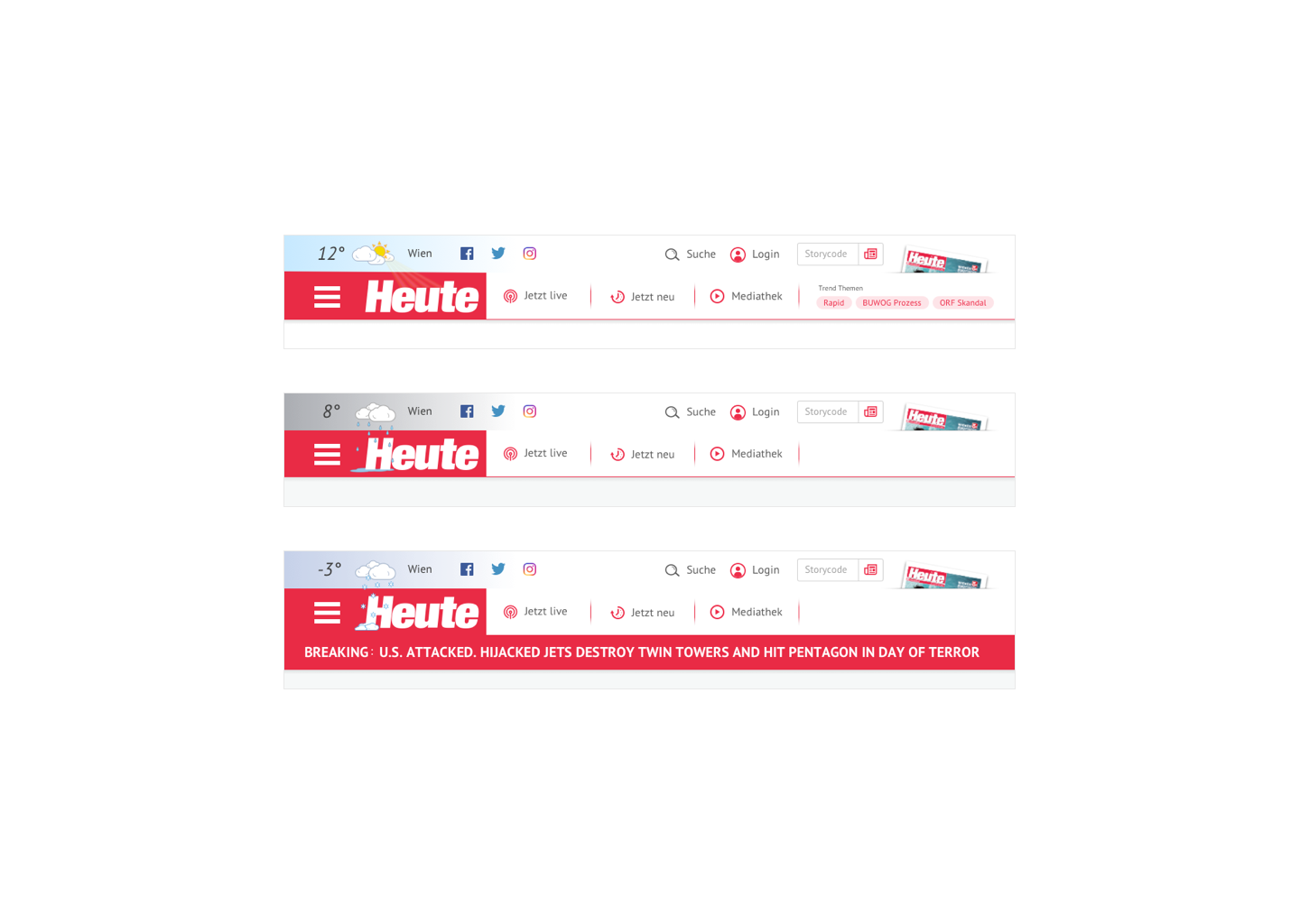
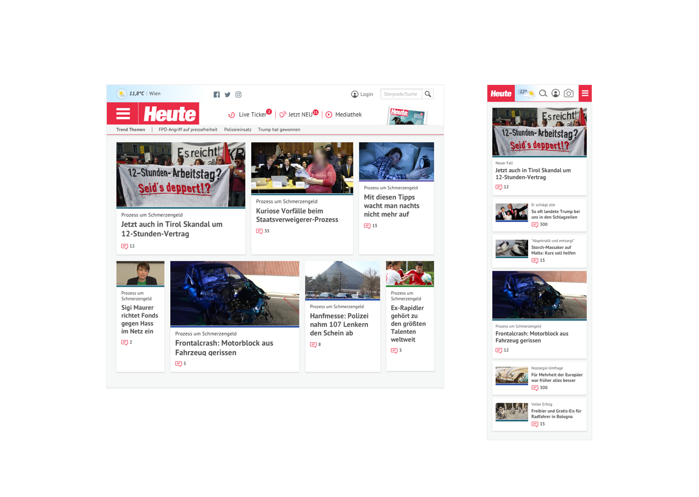
We introduced a weather indicator above the Heute logo, providing a playful, at-a-glance view of the day’s weather, complete with the current temperature. We included a space for a "ticker tape" style breaking news bar which sat at the head of all pages, for important must know news.
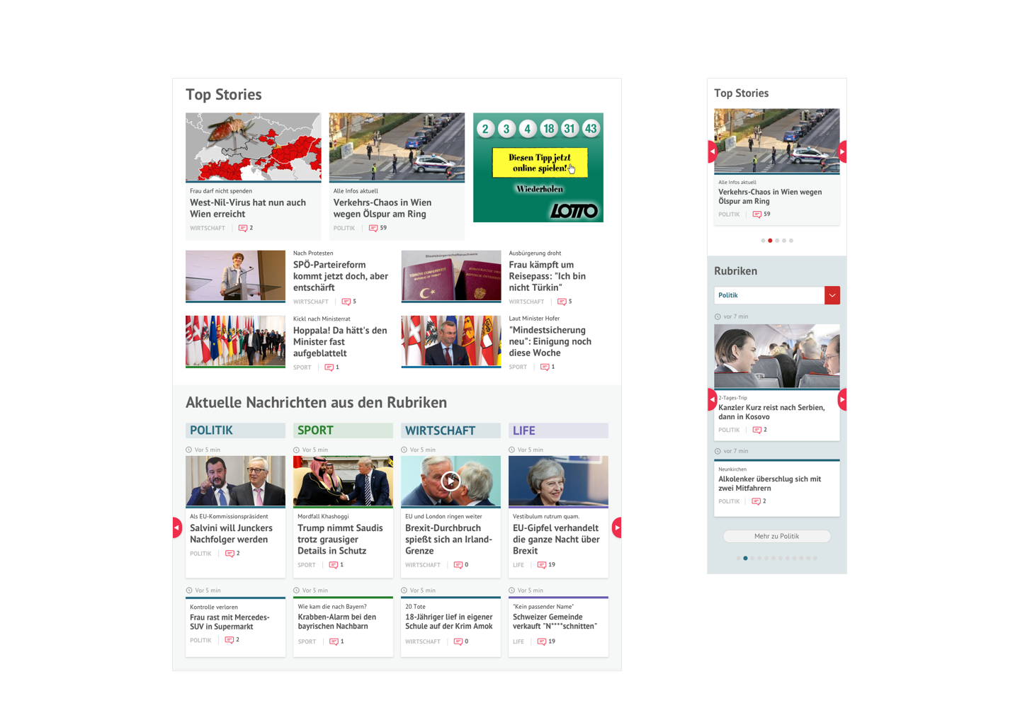
The menu introduced users to the color categorisation of the Heute website. Using color-coded bands, users could easily identify the category of a news post without needing multiple labels. For example, a red band under the post image signaled Austrian news, while a green band indicated sports.
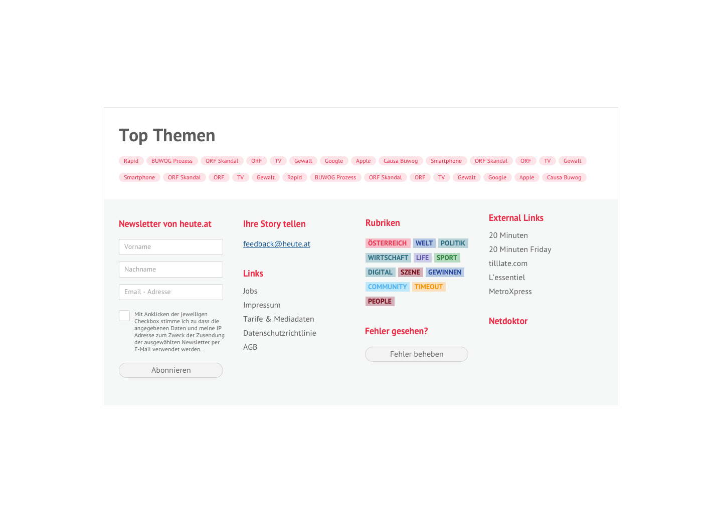
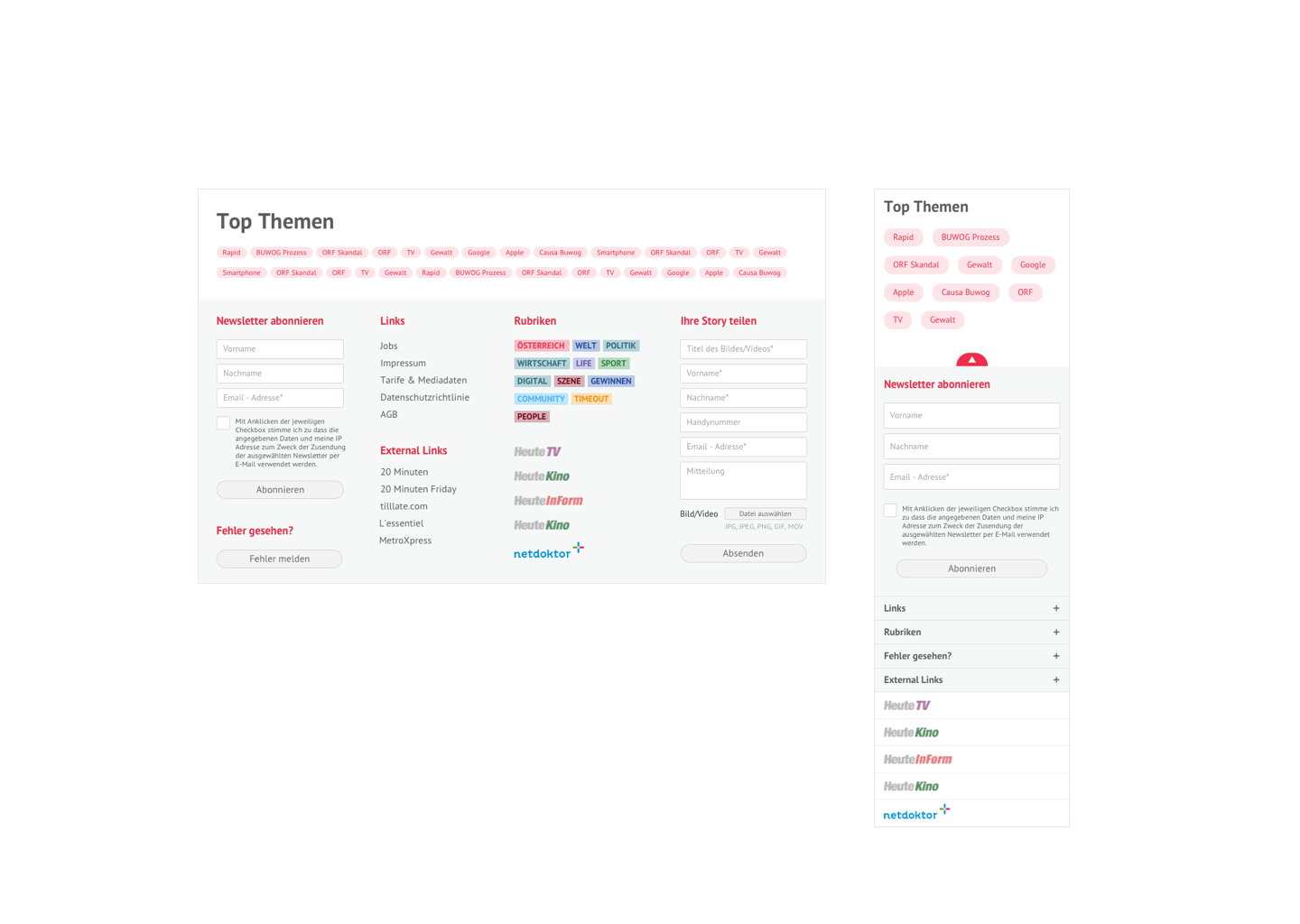
We implemented hashtag-like “themes” to categorise certain news postings. Users interested in following more stories along the same theme could click the tag, which would then display all related articles. Trending or viral themes were determined based on viewing statistics and promoted on each article page, as well as in the header when deemed necessary.
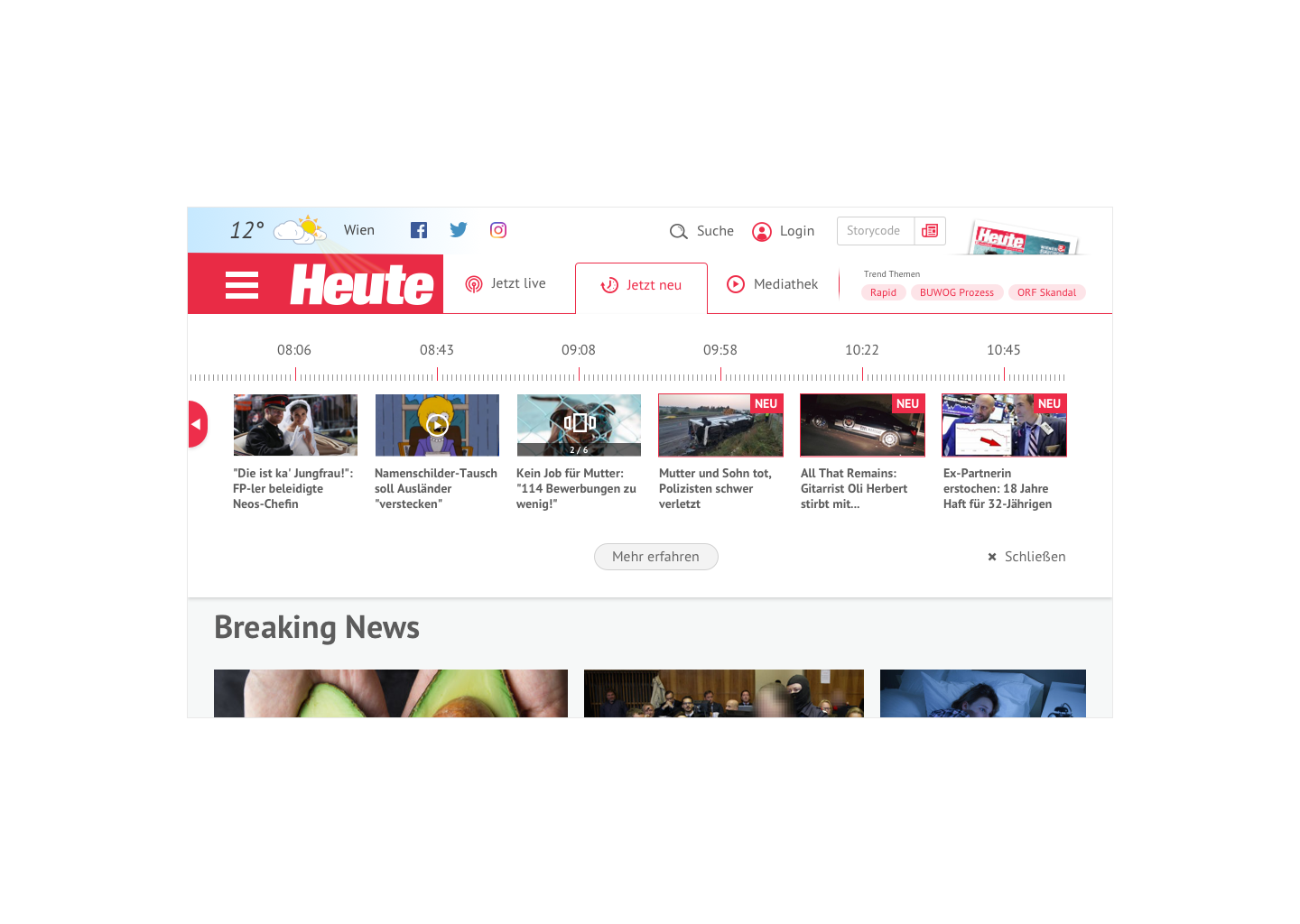
We proposed a timeline feature to display current news articles based on their publication time. This allowed users to see what they might have missed in the hours leading up to their visit to the page in order to "catchup" with what is going on in the world.


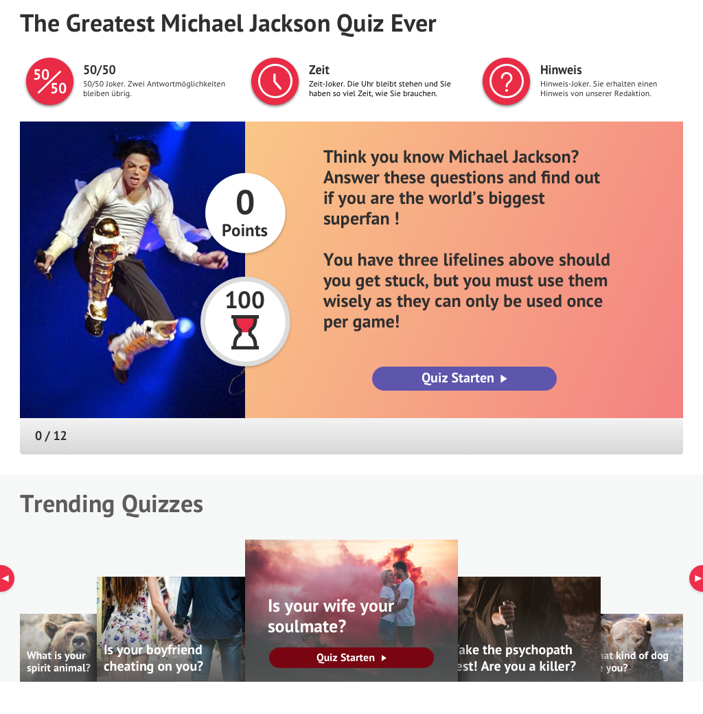
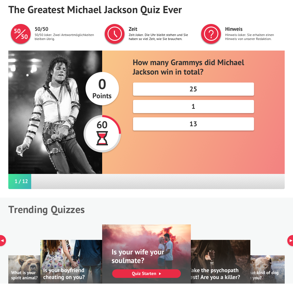
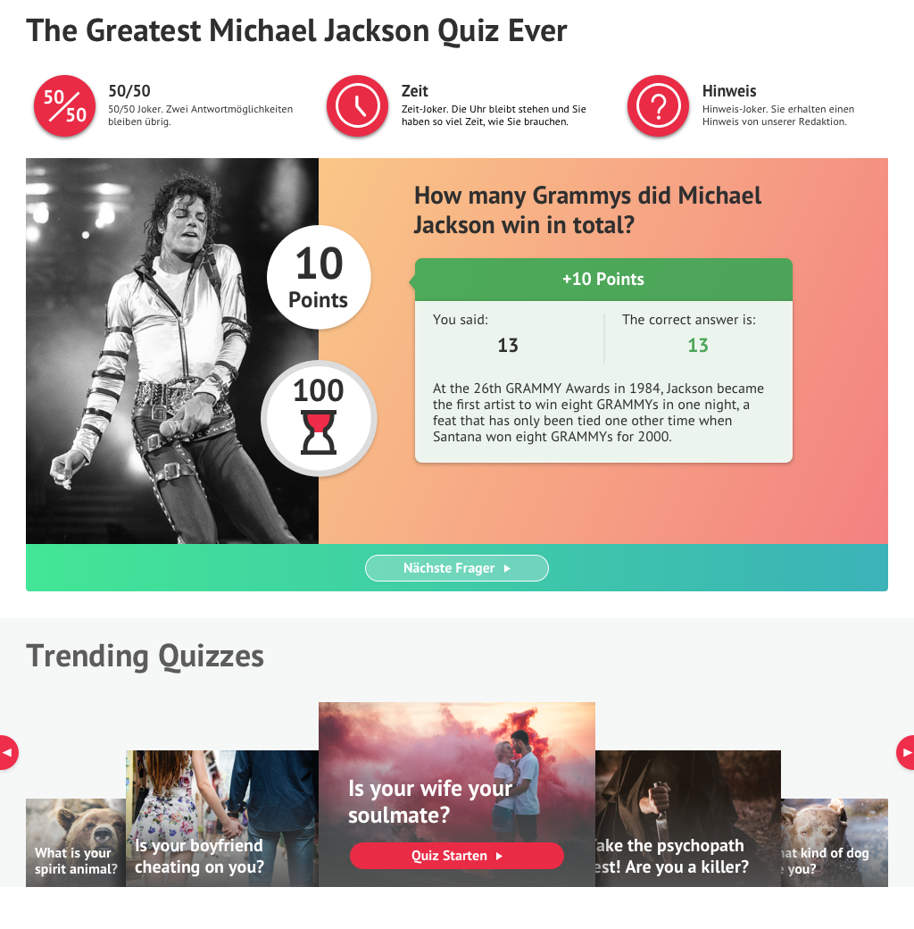
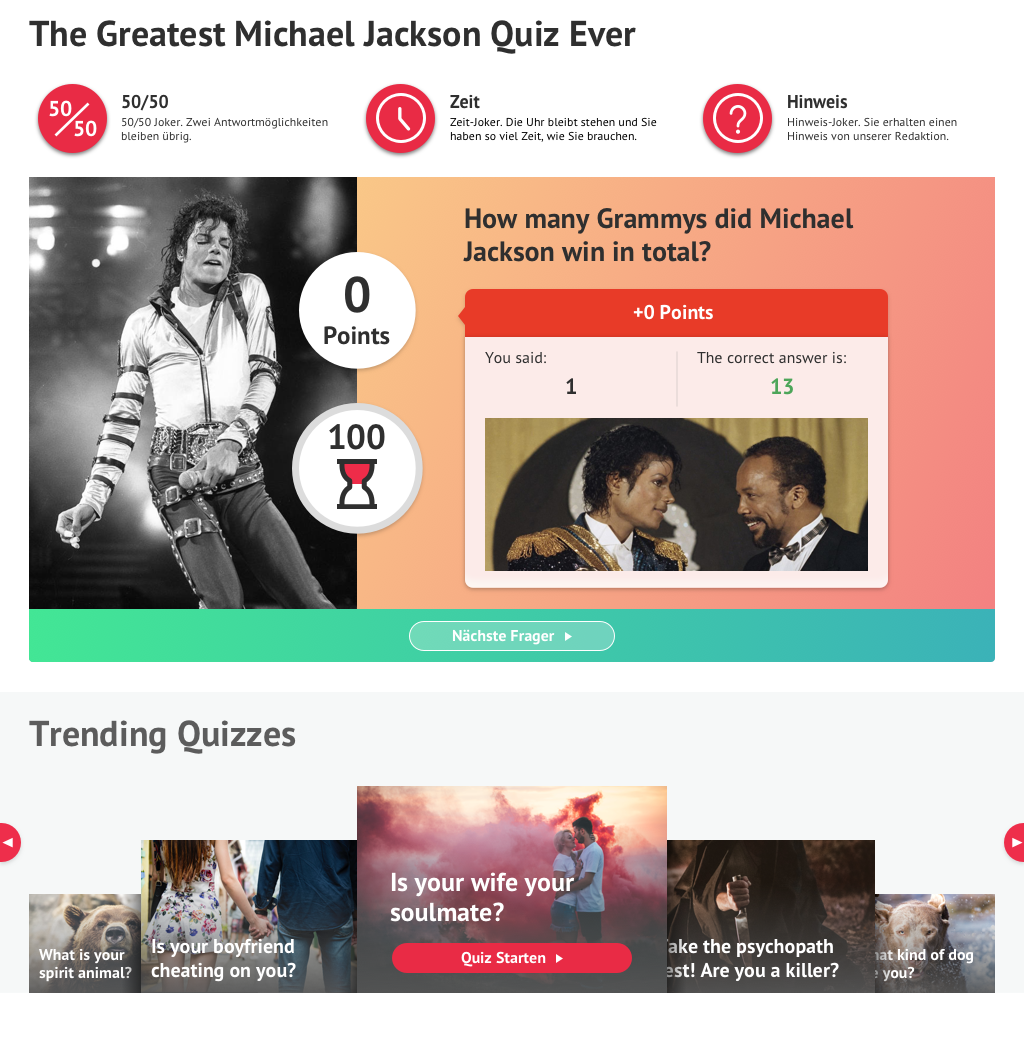
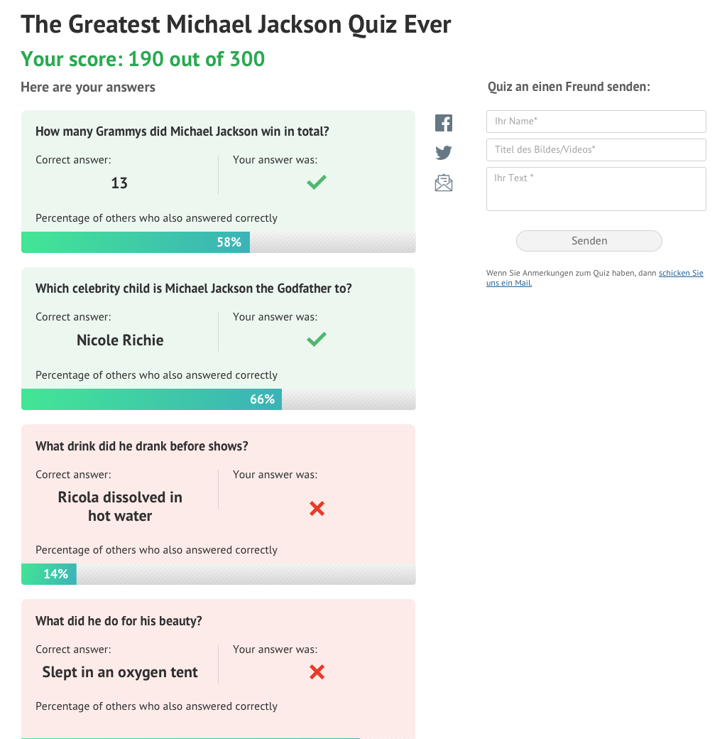
We also revamped several of Heute’s online quizzes to provide them with an “application-like” look and feel, making them more immersive and engaging. By incorporating interactive elements, sleek design, and intuitive navigation, we transformed the quizzes into a more dynamic user experience. This approach aimed to increase user participation and enjoyment, encouraging repeated engagement with the content and sharing.