Client: myTeledoc pitch
Type: Visual Design, Motion GFX, Print Flyer design
Program(s): Sketch, Adobe AfterEffects, Indesign
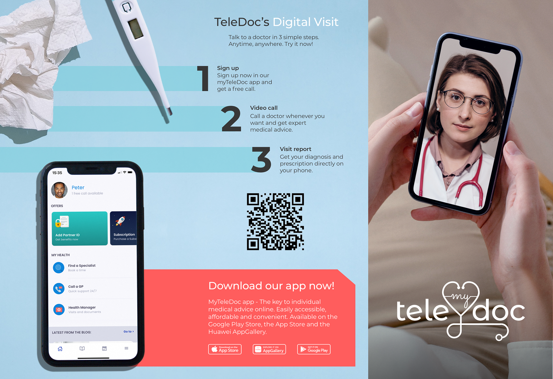
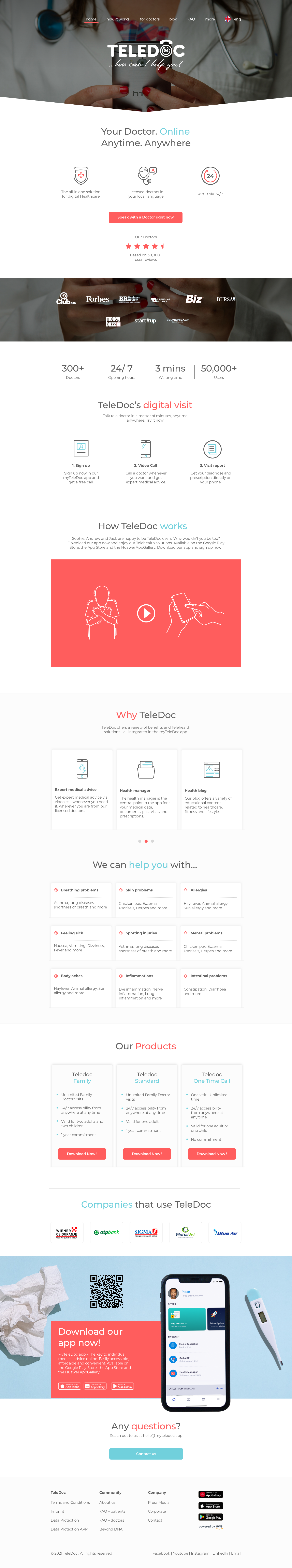
I was tasked with a quick turnaround pitch for a Teledoctor company. My goal was to design a fresh, responsive website that effectively conveyed who the company was, what they do, and how their services work. I used the metaphor of a doctor’s pocket at the top of the page to structure the content which also served as an arrow, guiding users’ eyes down the page.
On the landing page I included a rough overview storyboard video to provide customers with a quick understanding of how the service operates. The storyboard I envisioned was a scenario where a person was on holiday in a foreign country and they didn’t speak the language. Feeling unwell, they remembered a Teledoc flyer they had received at the airport. They scanned the QR code and promptly connected with a doctor who in turn provided a prescription for medicine to alleviate their symptoms. They then visited a local pharmacy to obtain the medication and soon felt better.
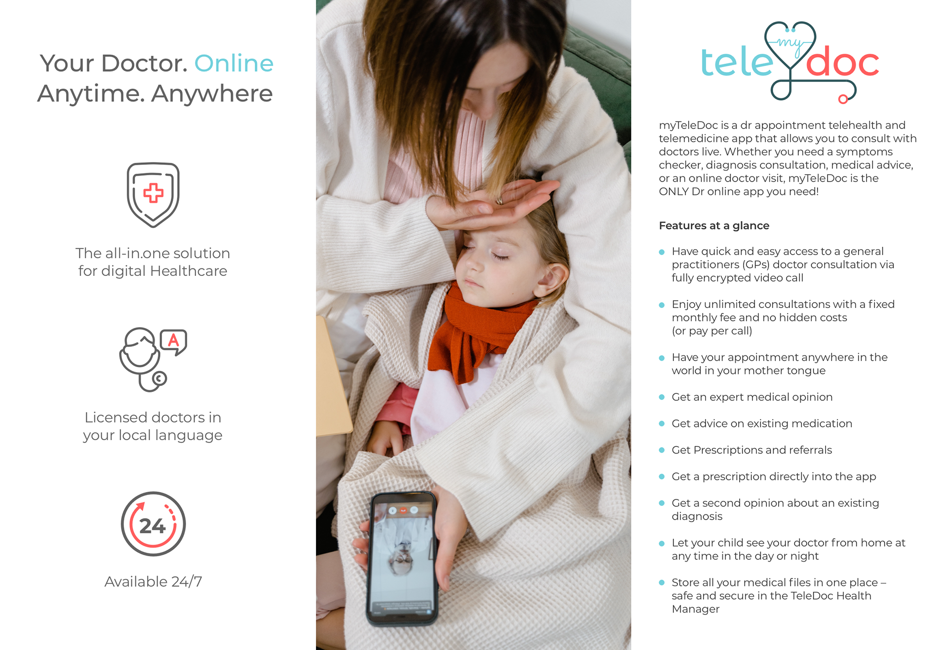
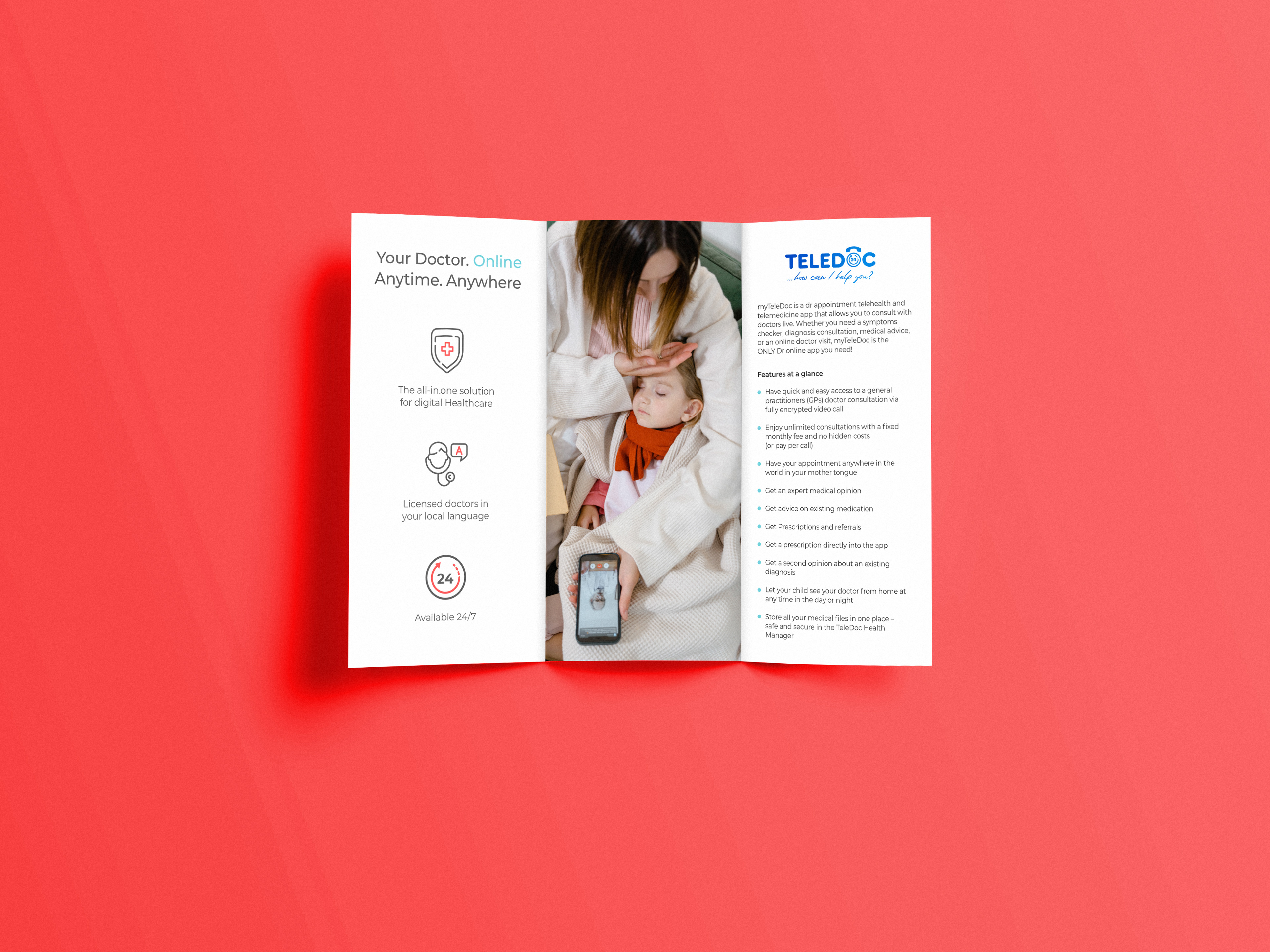
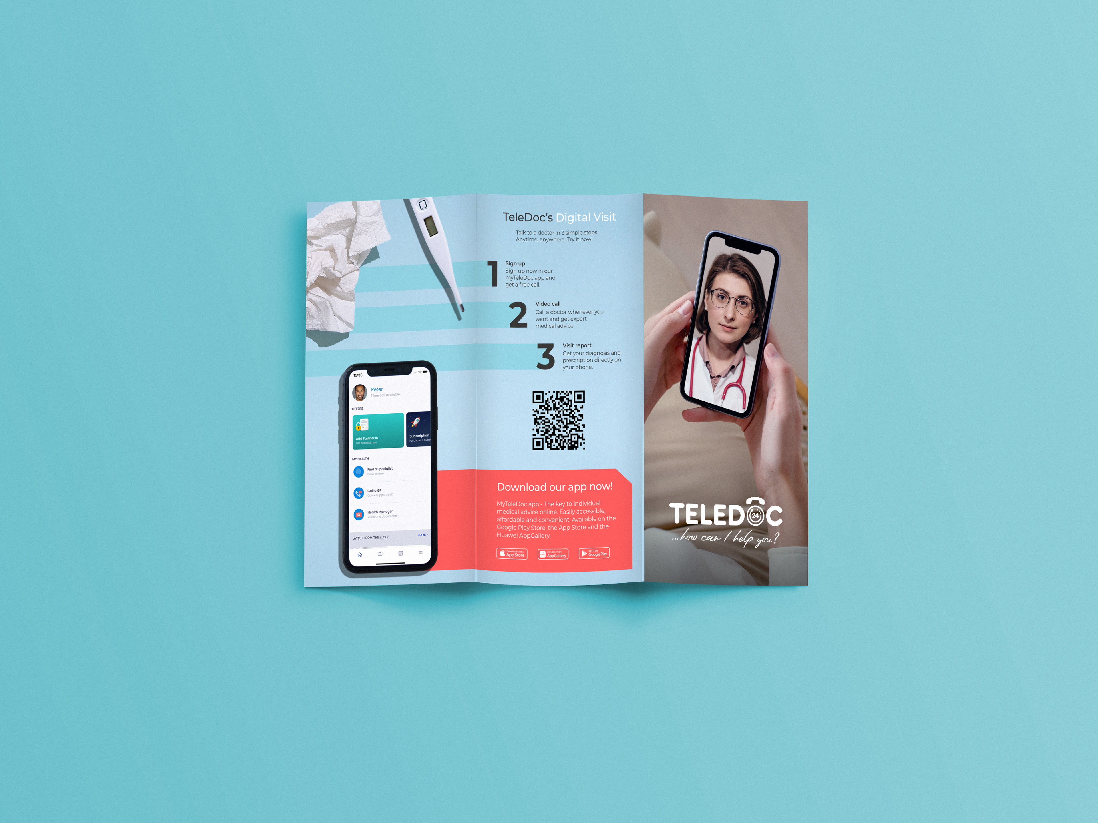
To complement the video, I designed a mockup of what the flyer could look like. I envisioned it being placed in shopping bags at duty-free shops in airports or tucked into the seat pocket on airplanes.
As part of the website refresh, I also proposed perhaps using a modernised logo redesign that aimed to resonate more with people on a personal level. The existing logo, while effective in signalling a 24-hour service, lacked the warm, approachable appeal of a trusted doctor.